Building a brand
Case Study
Neocis
Neocis, a robotics healthcare startup, is transforming dental implant surgery with advanced robotics. The company is focused on enhancing dental surgeons’ capabilities and advancing patient care through the latest technology.
Services
Rebranding
Web site design and programming
SEO
Software UI design
Patient education collateral
Practice marketing materials
Tradeshow booth design
Social campaigns
Photography

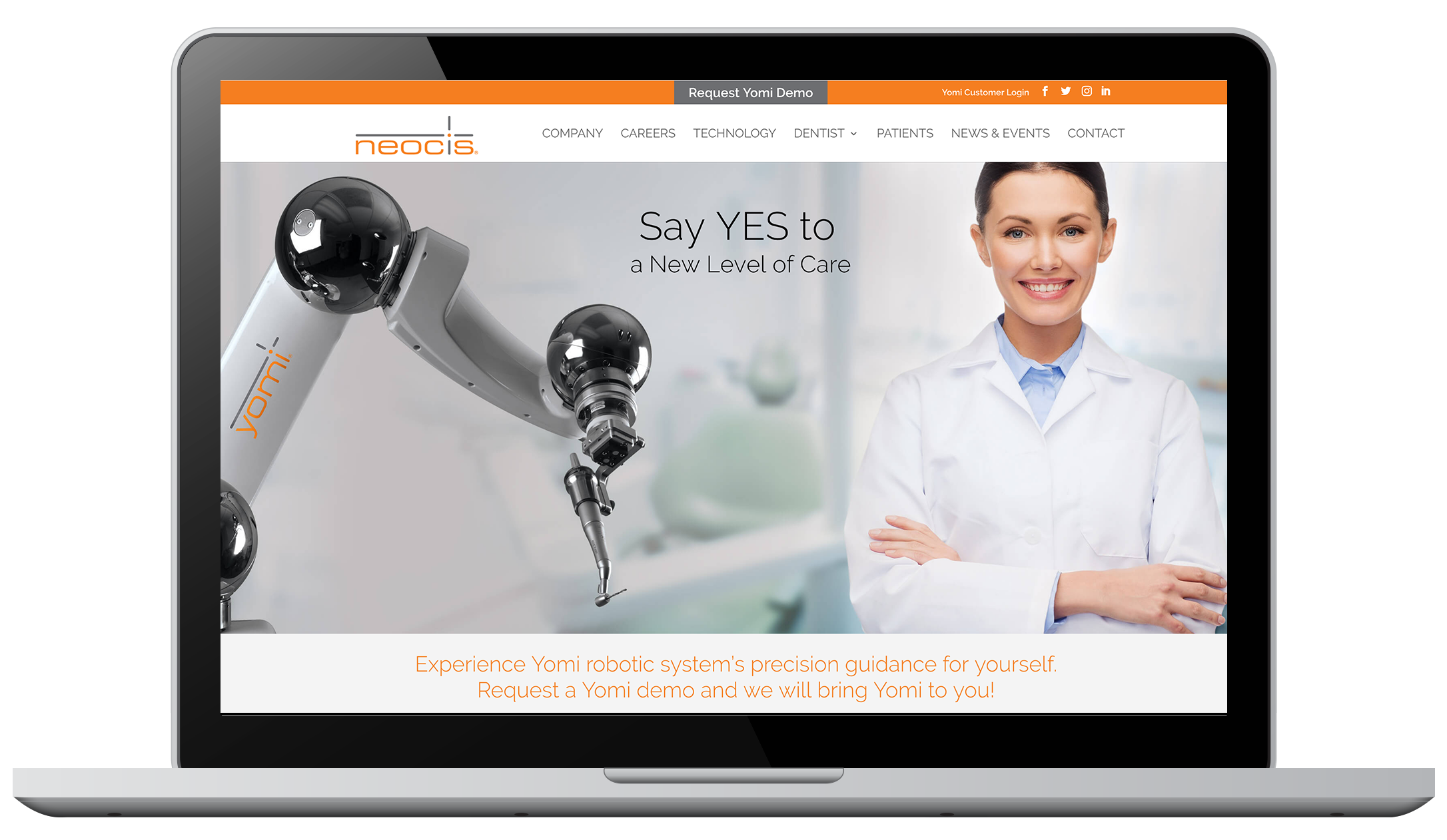
Brand Strategy
Focus on the elevated patient experience robotic technology provides.
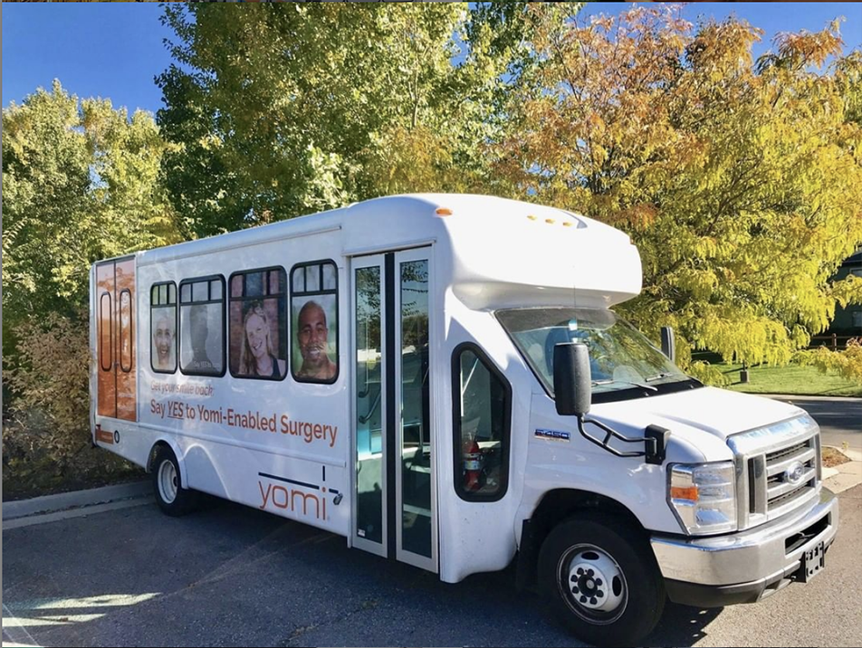
Initially the Neocis brand centered on its robotic technology, Yomi. When rebranding, the decision was made to change the focus to include both Yomi and how it elevates the patient and dentist experience. New visuals were designed to highlight the patient story while showcasing the state-of-the-art dental technology. Strategic campaigns were developed to target practices, support users with patient education, and appeal to investors.
Dentist
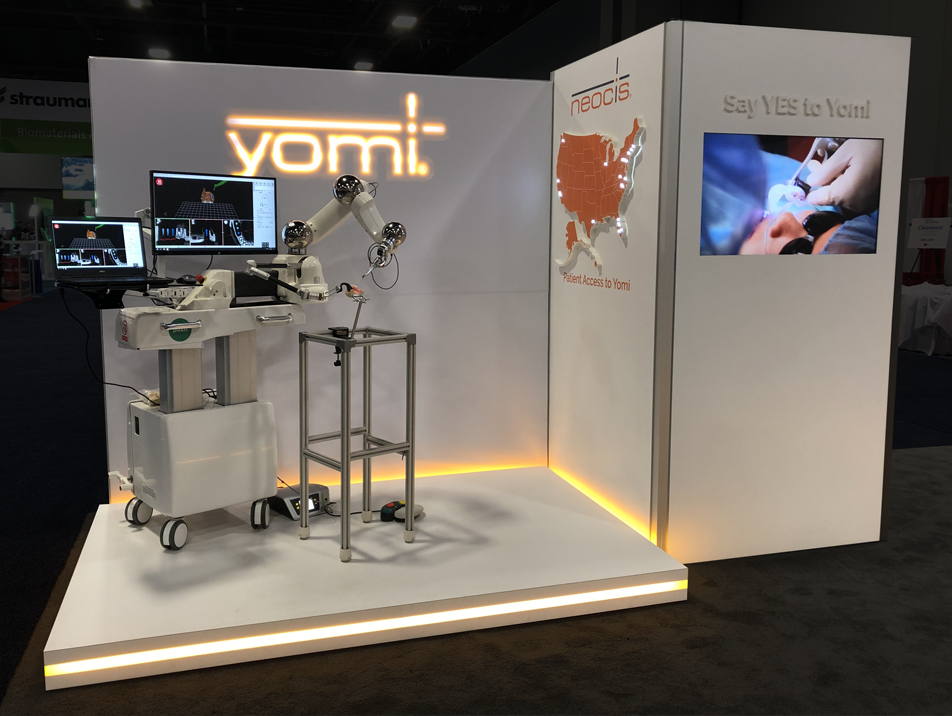
The best way to understand the benefits Yomi brings to a practice is to FEEL it! Throughout the Web site our strategy is to focus on asking for demo requests from qualified leads and then following up by bringing Yomi to them. Having the “Ask” front and center throughout our marketing campaigns drives demos that turn into sales.
Technology
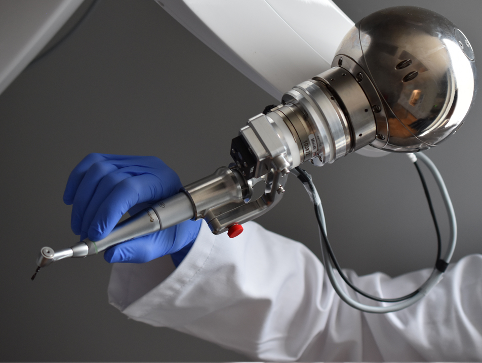
Yomi’s haptic technology provides physical cues that guide the dental surgeon’s hand to the precise angulation and location for planned procedure. To showcase the benefit of “Feel” – we use elegant photography, graphic icons, micro motion graphics, animations and surgical video.
Patients
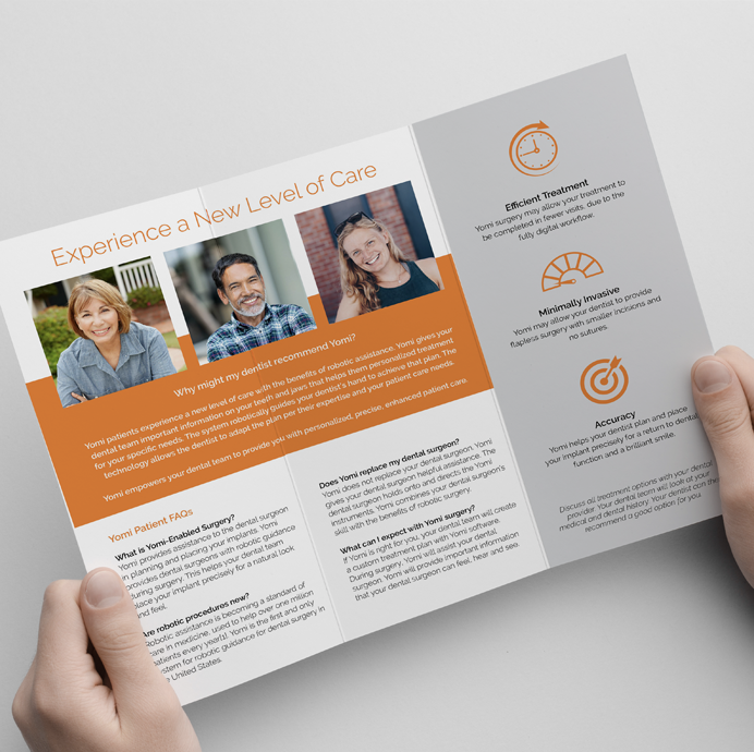
New technology can be both exciting and nerve-racking for patients. Through out patient materials and the Web site we tell real patient stories with text and video testimonials. Hearing from patients in their words builds trust in the technology and brand.
Design
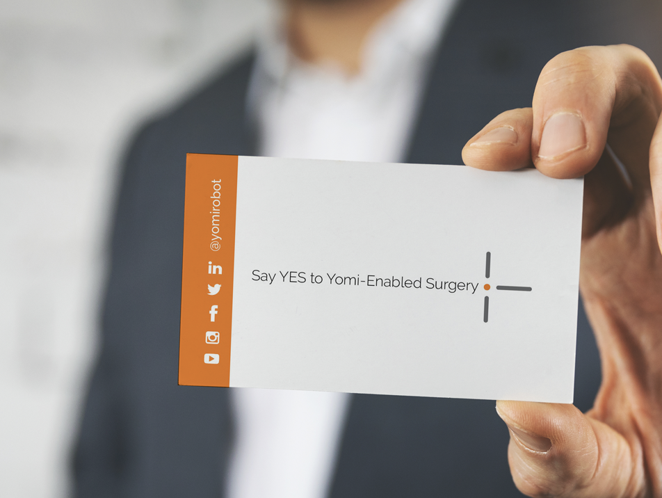
The product logo was updated from a bulky blue to a streamlined version closely resembling the updated corporate logo. The elegant solution visually incorporates the precision benefit. To differentiate the company from standard dental blues, a simplified color palette of whites and grays with a pop of orange was chosen.
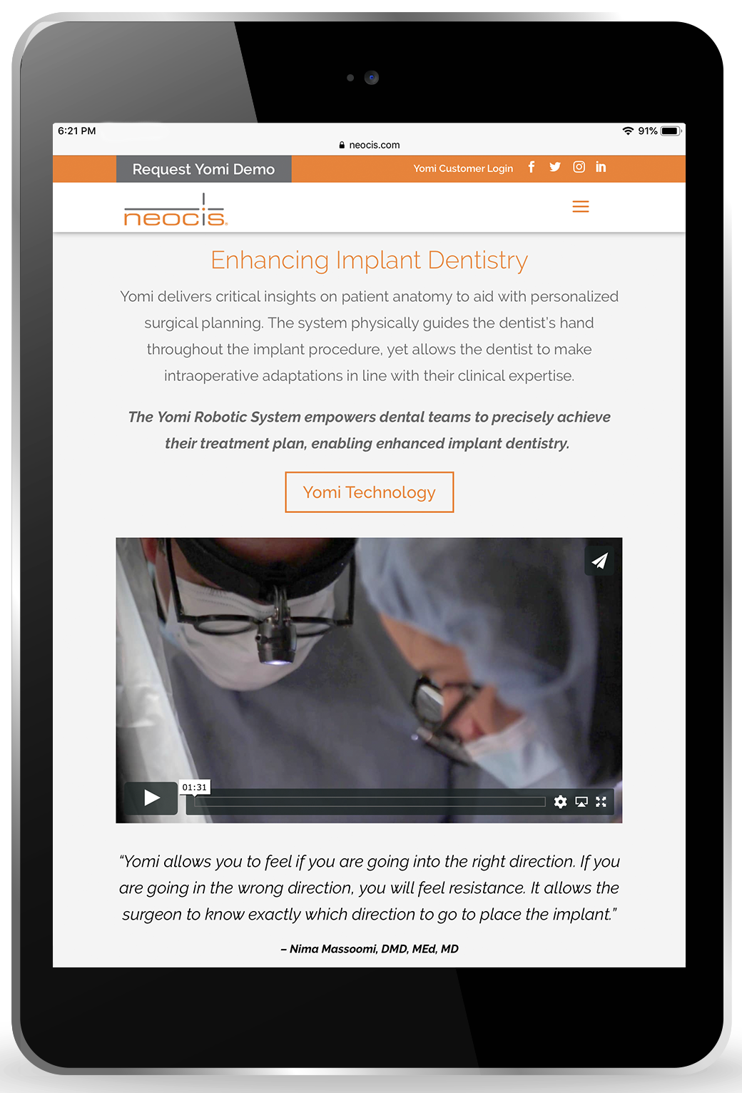
Sleek Design
simplified with maximum white space and pops of orange
Video Rich Content
dentists and patients telling you what you want to know
Targeted Messaging
content geared towards dentists, patients and investors
SEO
thoughtful optimization with keywords that drive traffic
Mobile Responsive
a user experience that looks good on all devices
User Portal
Via the user portal on the Web site, practices can easily access training presentations, clinical documents and order consumables.
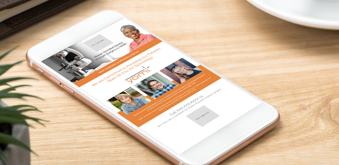
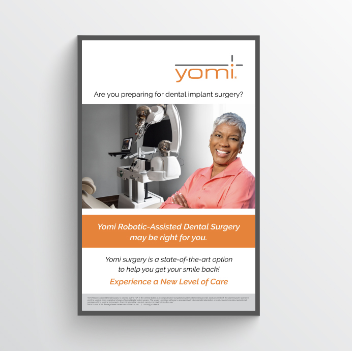
To further drive patient adoption, Neocis supports dental practices with patient education materials. Practices can download a variety of templated collateral and then customize with their brand and contact information. This allows Neocis to stay compliant with approved product messaging while allowing practices to provide patients with customized educational materials.
